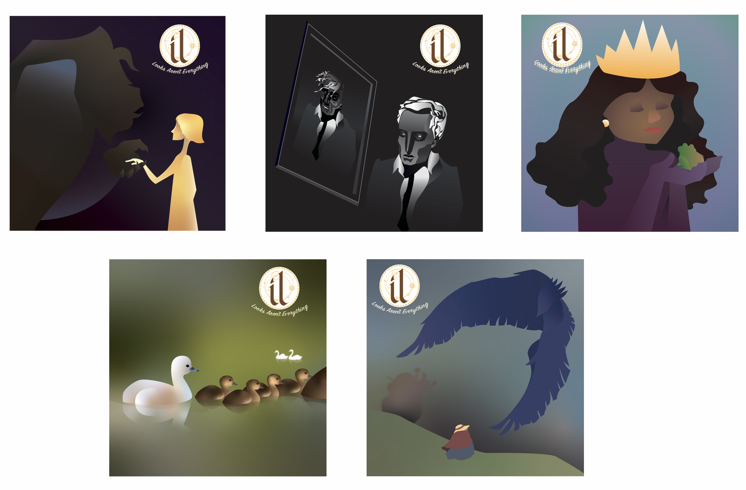
~Mission Statement~
Develop a unique, athletics-centered beer brand for the partnership between the University of Northern Colorado and Yetter's Brewing Company’s new NoCo Gold American Lager beer brand,
~Obstacles~
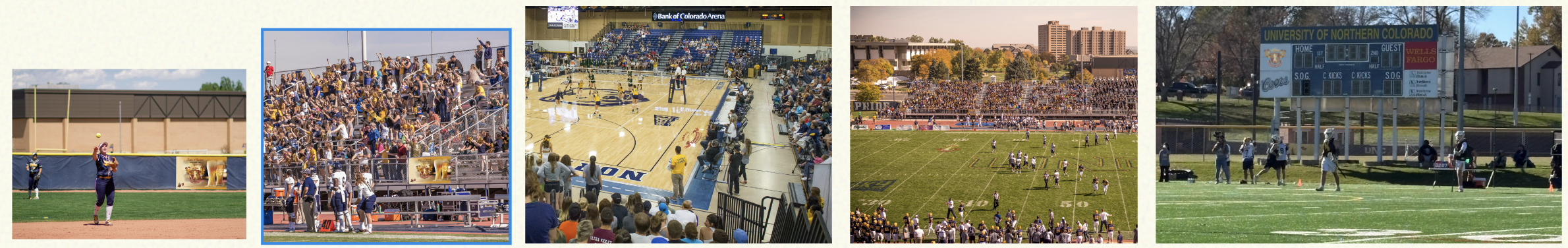
Our surveys indicate a general lack of school spirit, particularly in sports. Primarily, our football team has a long string of losses, which has lead to much discouragement.
UNC’s has a relatively small and tame Greek Life community
~Our Approach~
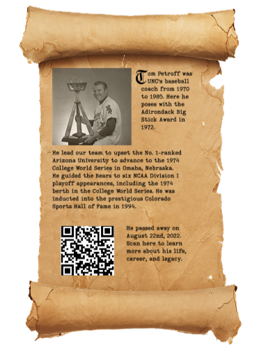
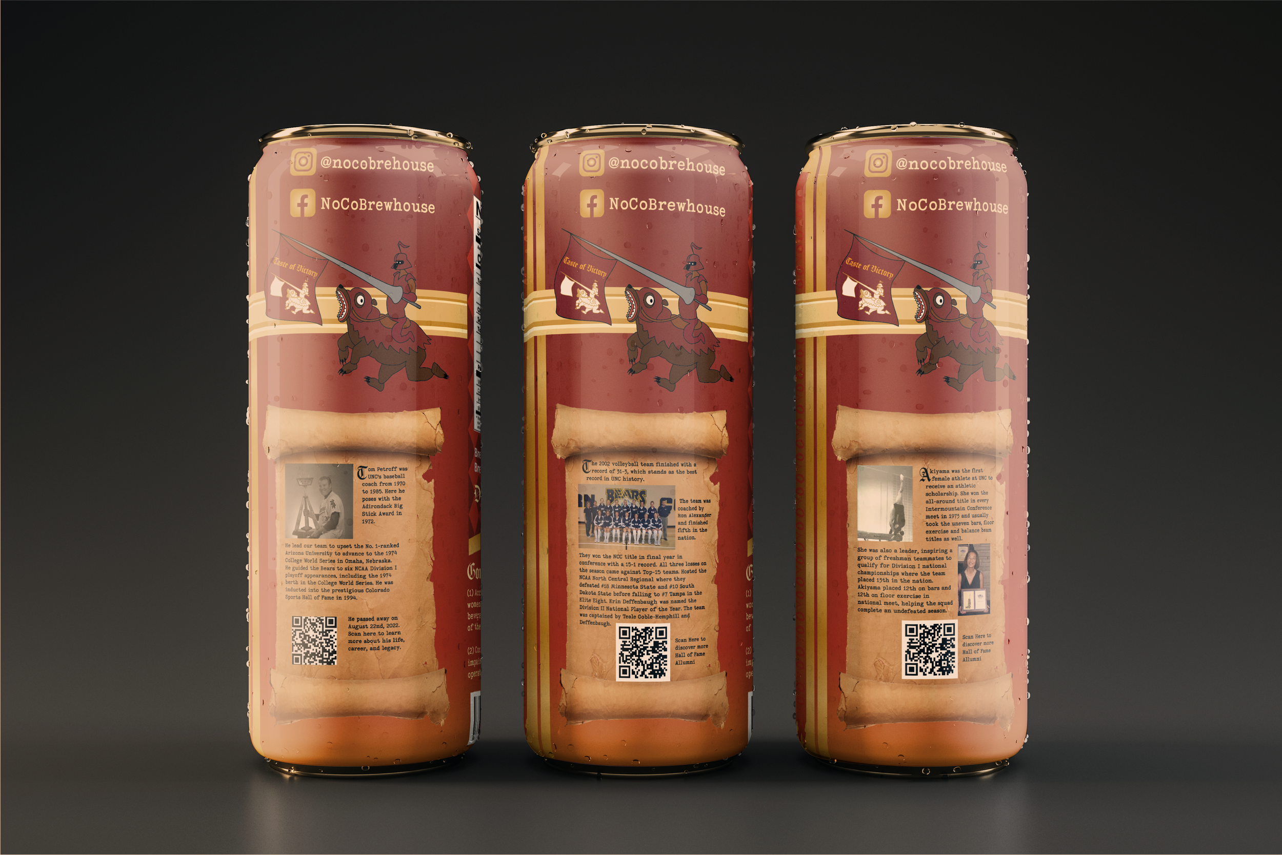
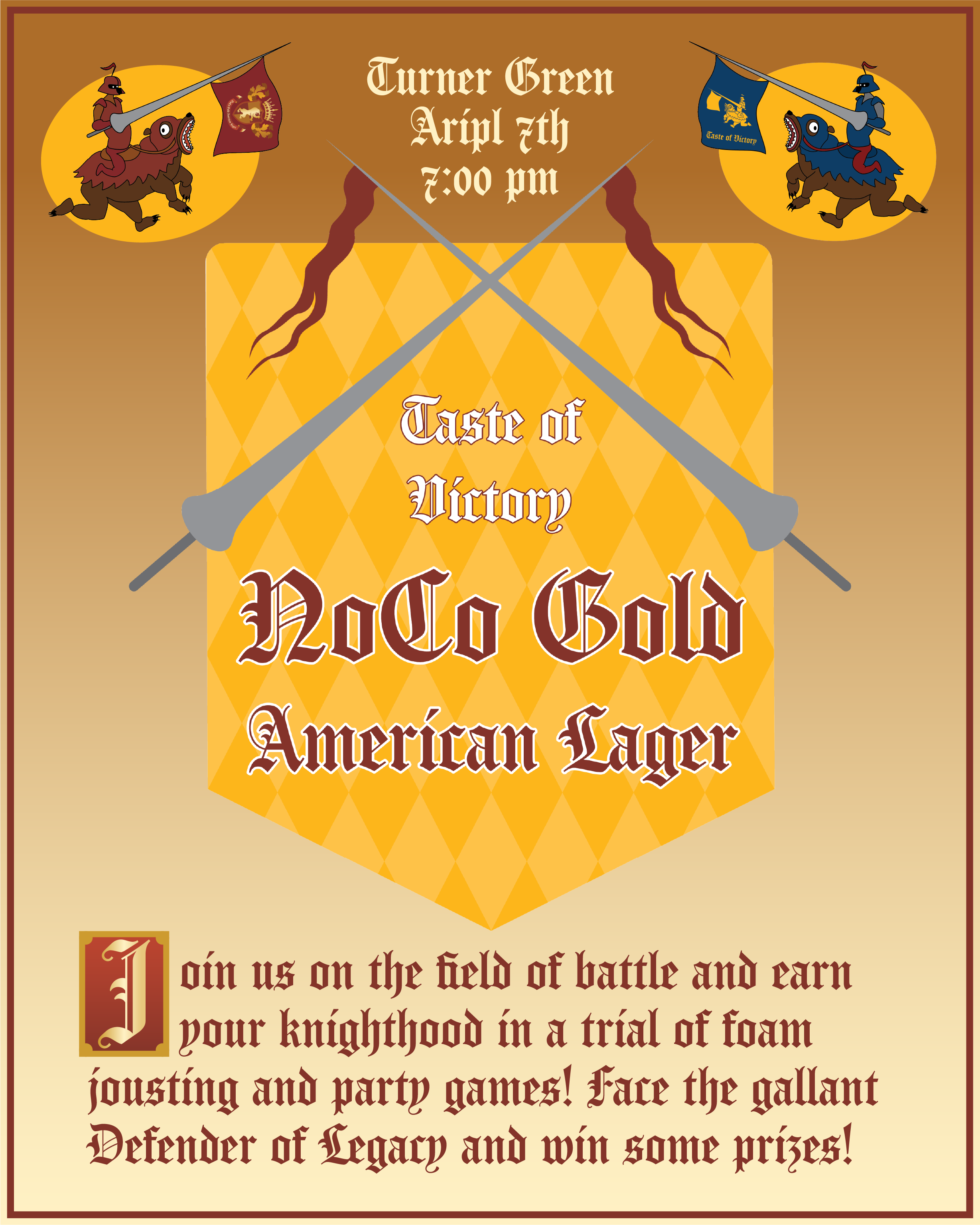
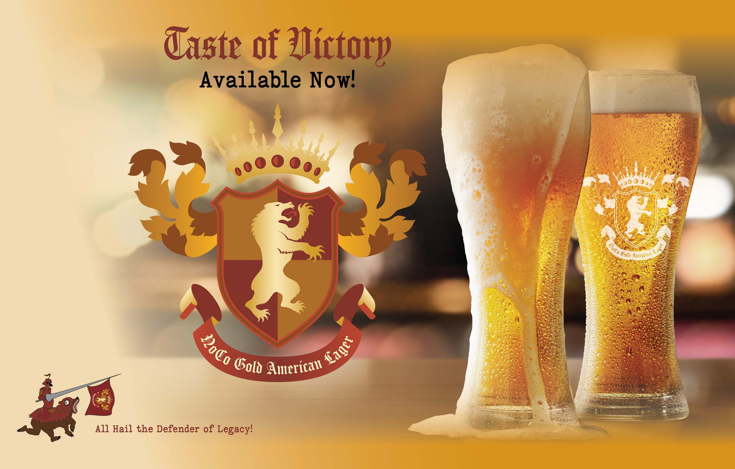
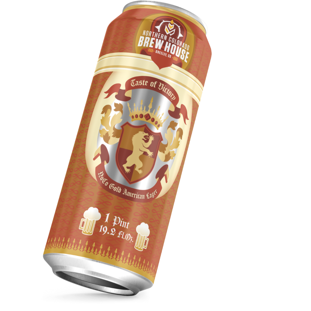
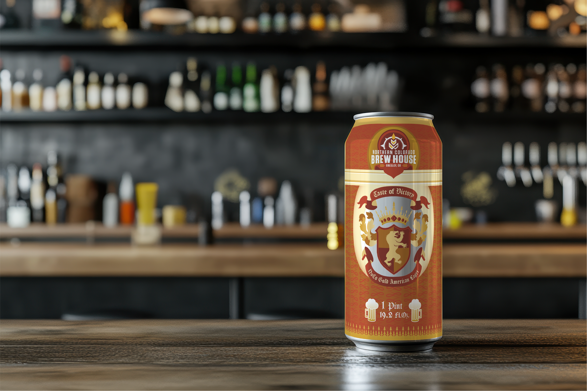
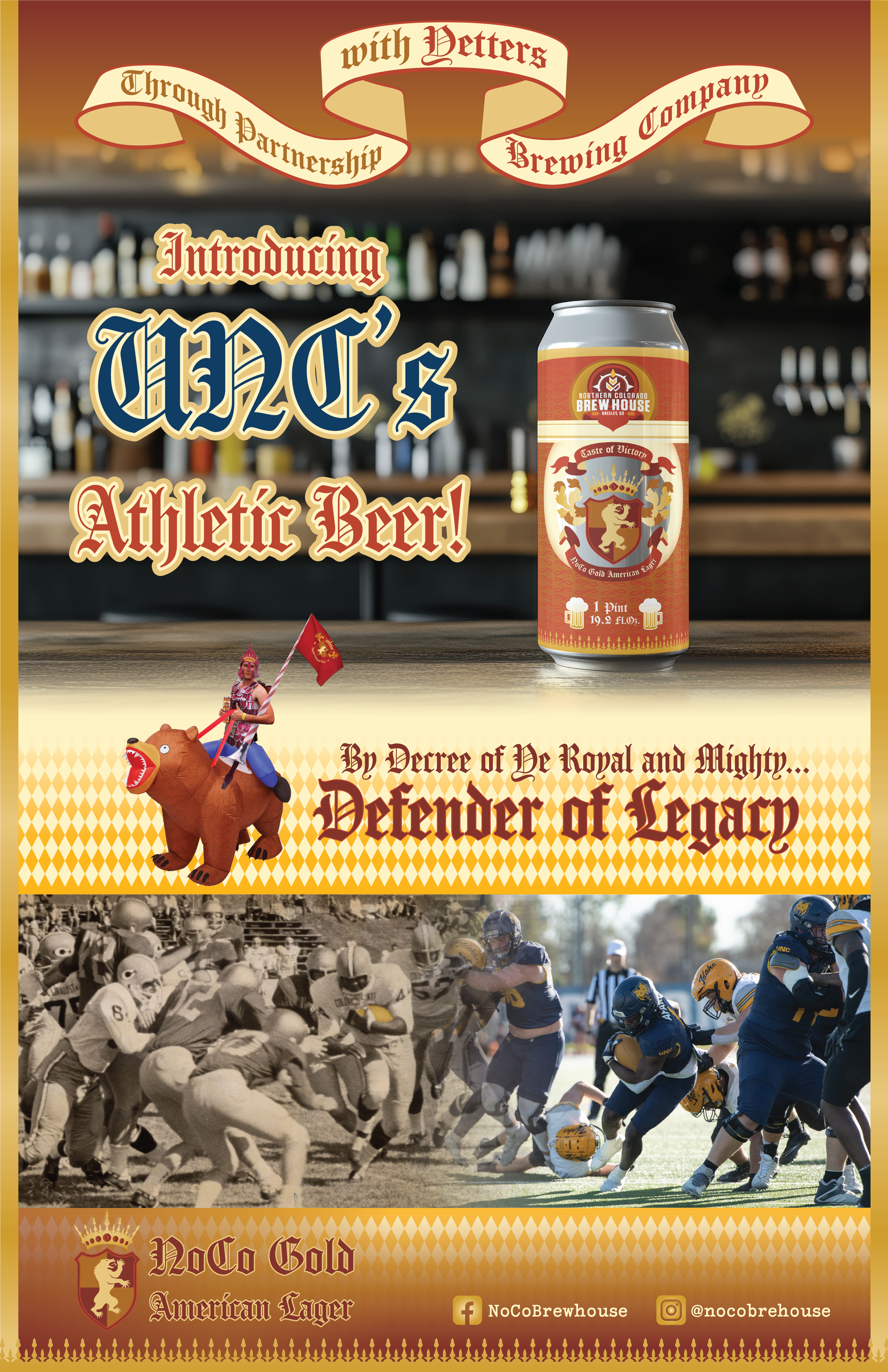
The key is legacy. In spire through our history. In every can, history, in hand victory. UNC is a small, but very old school with rich history that practically no students hear about. We shall inform and inspire, and show that we should be proud to be the underdogs. Focus on sports and athletes outside of just football, such as our surprisingly excellent volleyball team.
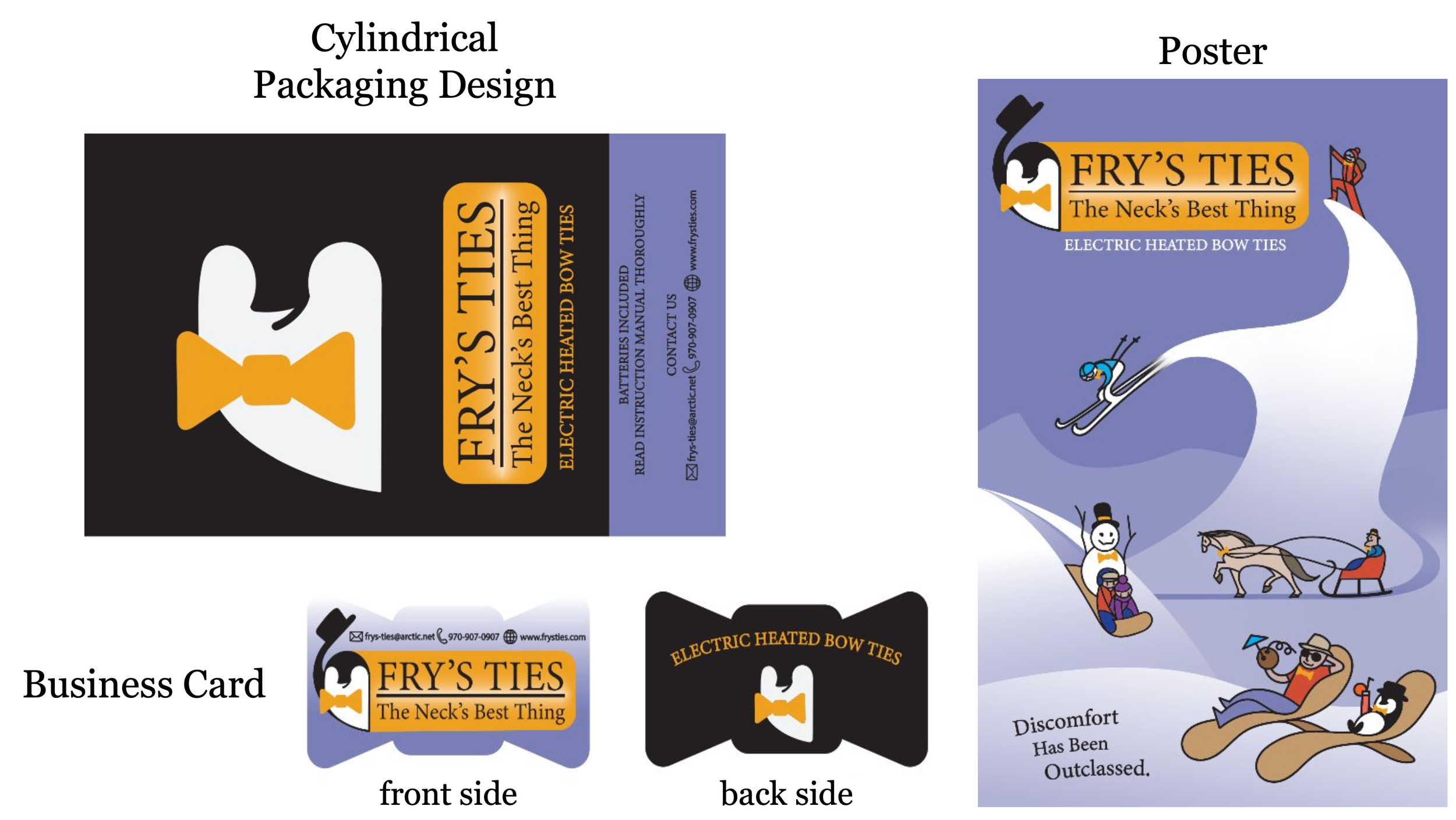
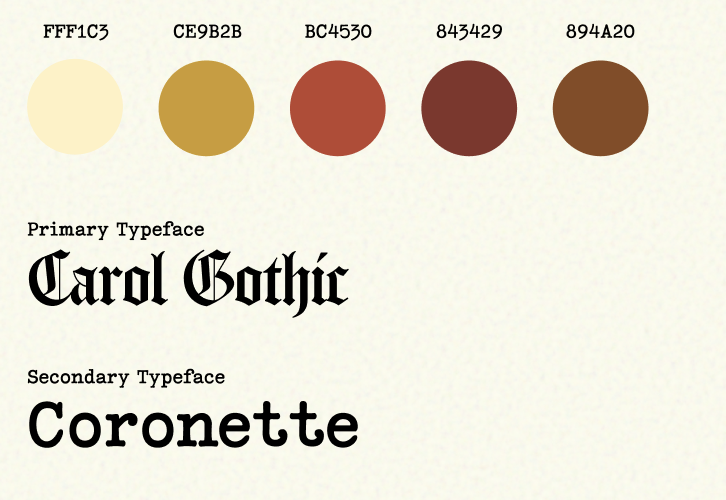
~Style~
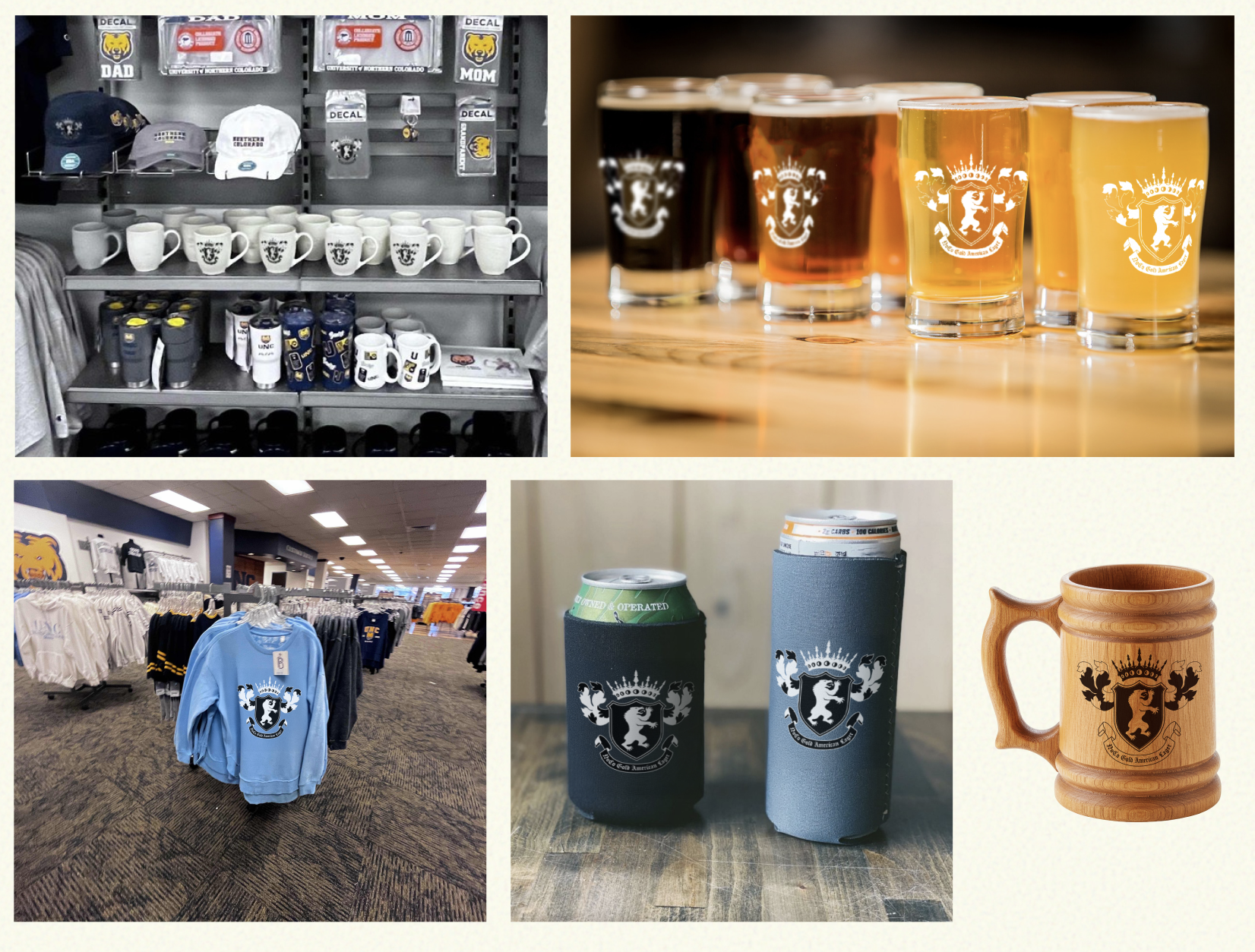
We also wanted an element of fun as well Most branding agencies cannot keep up with younger generations, and thus fail to capitalize on a great potential. With high student engagement, we would create a culture by the students and for the students, with the ability to adapt and change in the future. We would start with 12 unique can designs, each telling its own story of a certain UNC Team, athlete, or coach.
~Audience~
Primarily University Students, alongside parents and Alumni. However, it should have the capacity to expand into its own distinct brand for future distribution into real liquor stores.

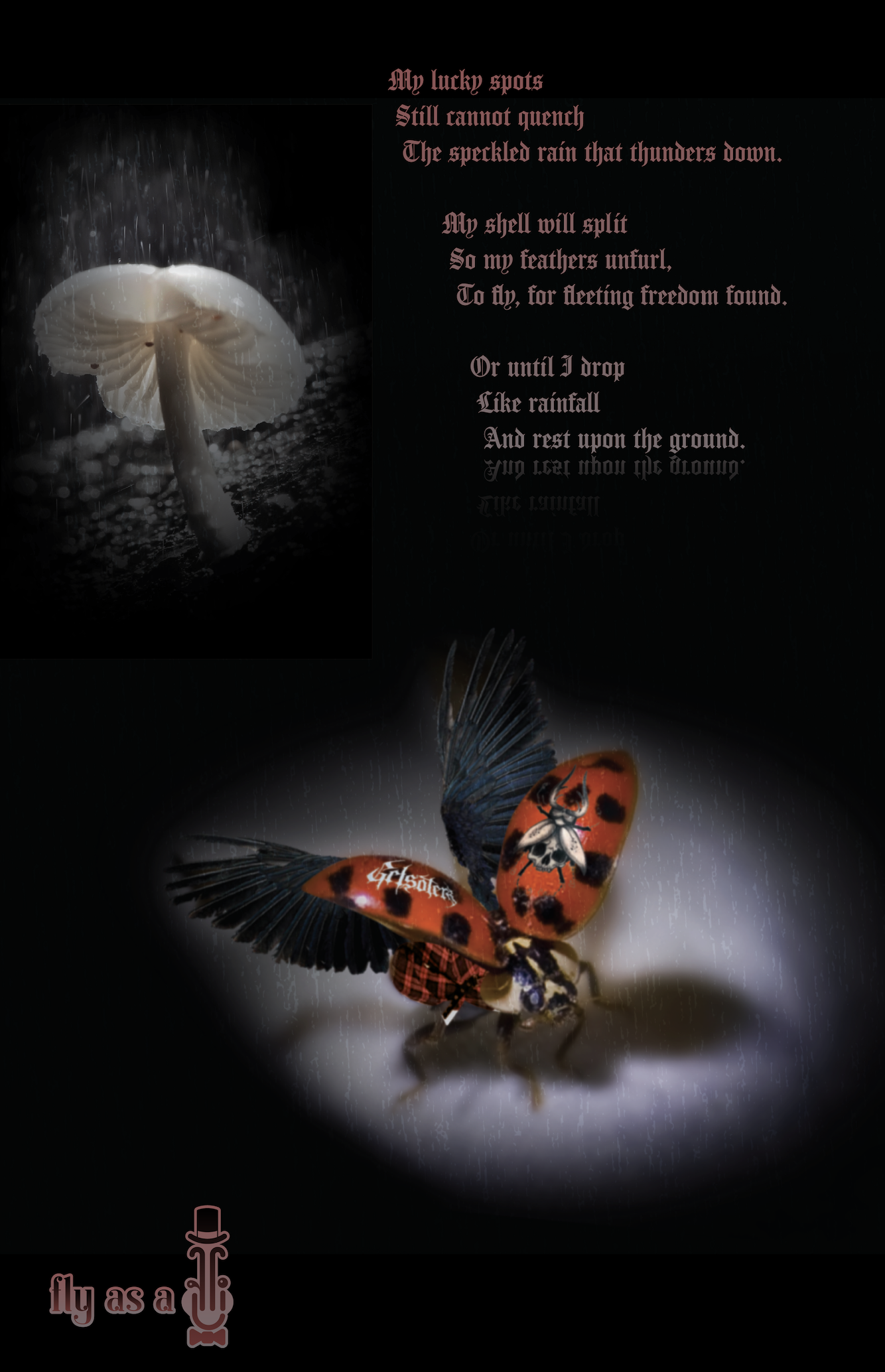
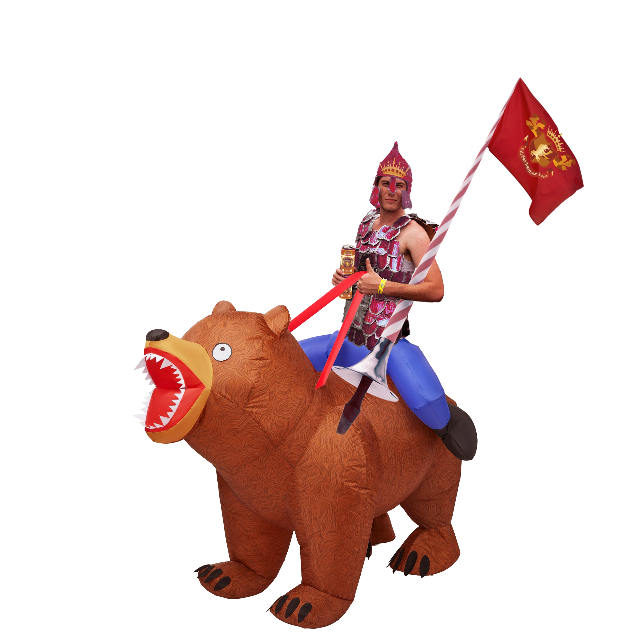
~Medieval~
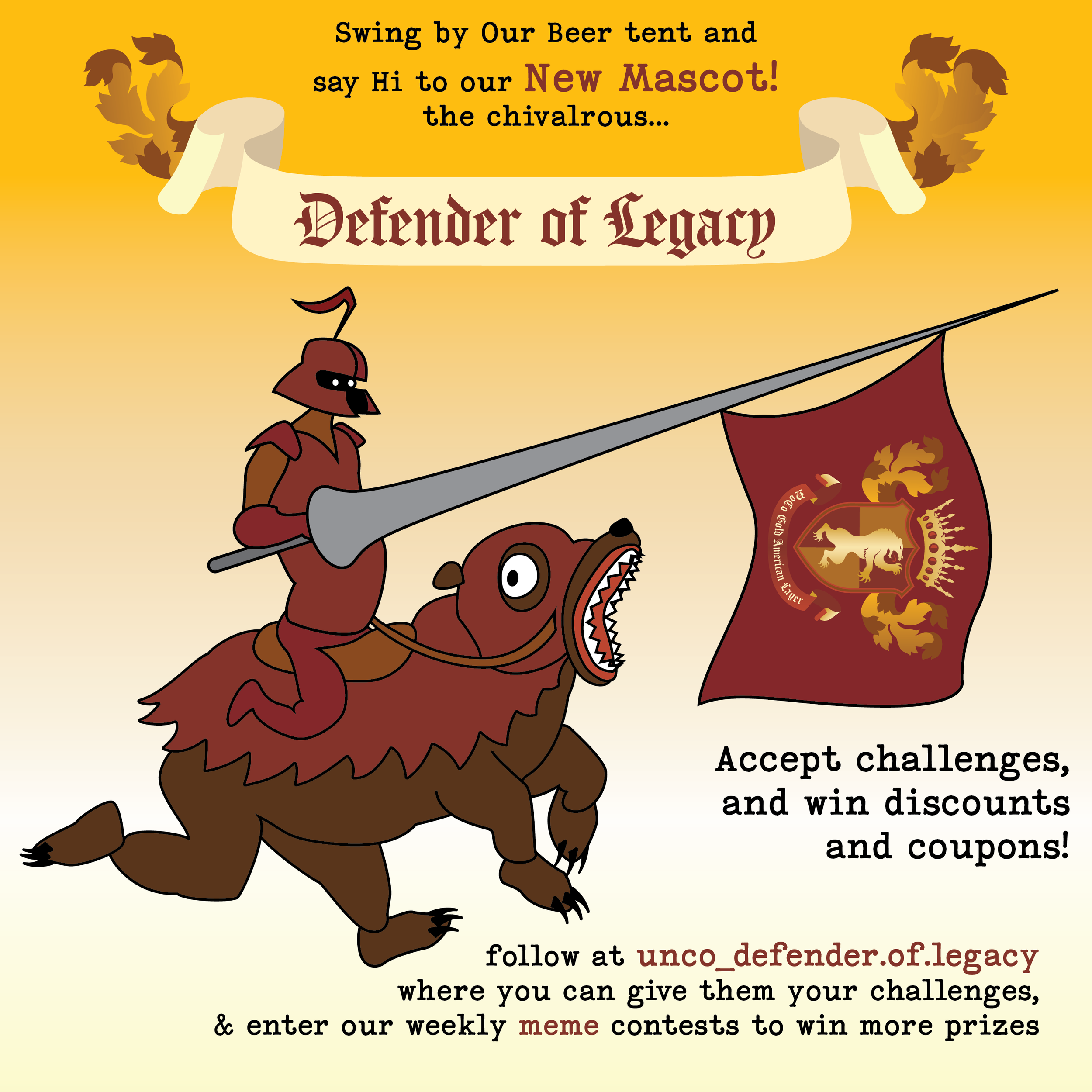
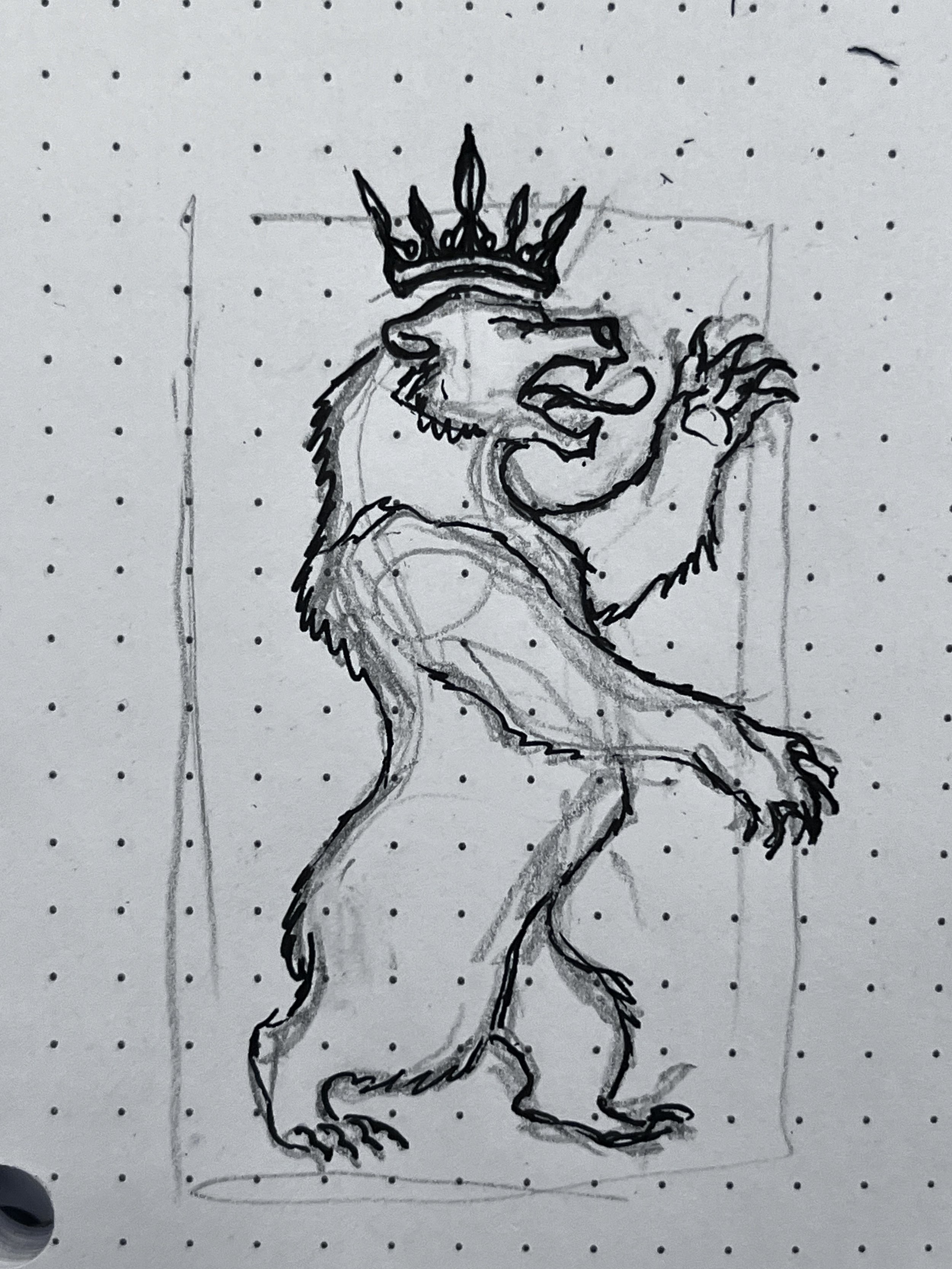
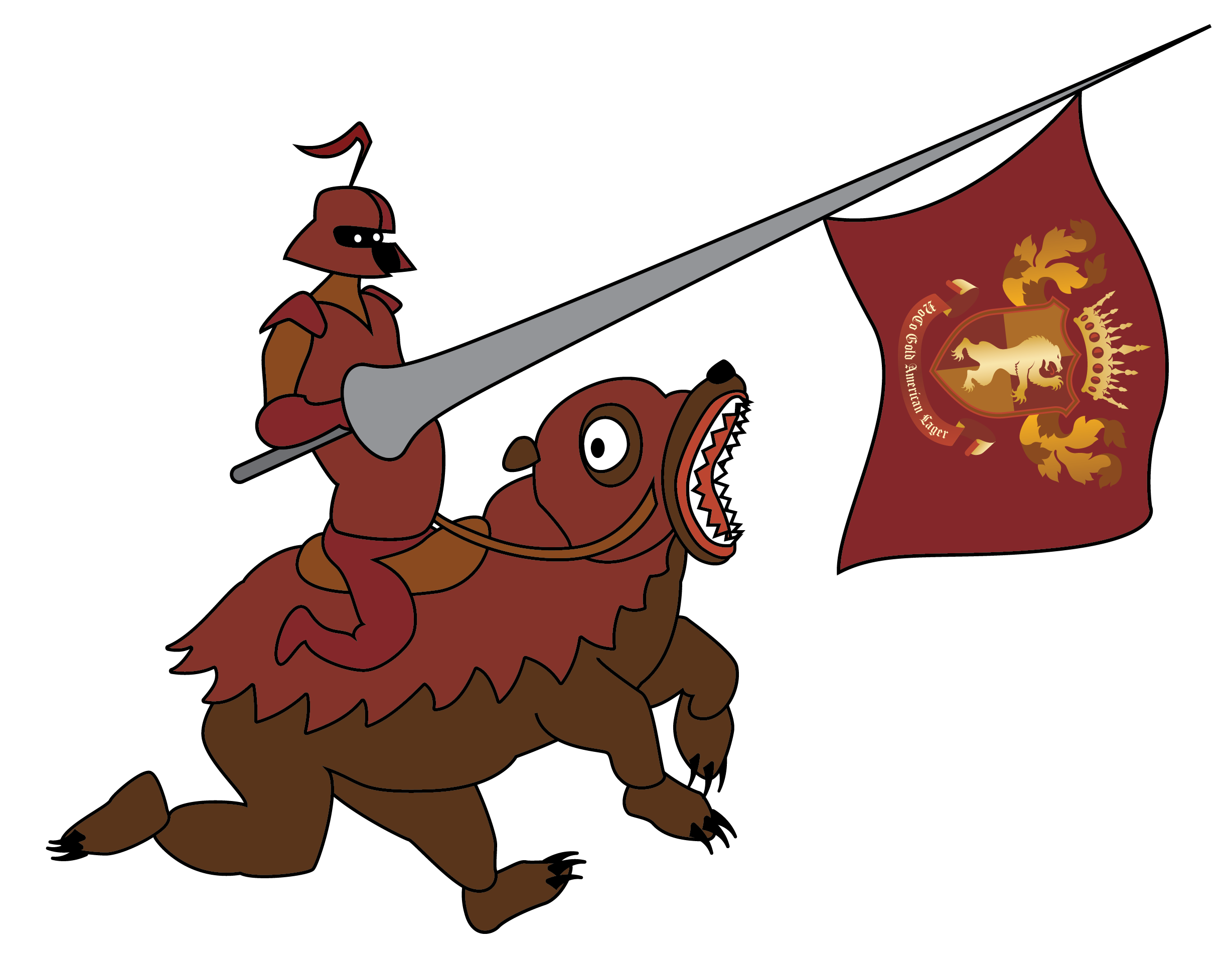
We did not want to take ourselves too seriously. Difficulty distinguishing from UNC’s brand, settled on a medieval approach from the legacy and history, heraldry, fighting spirit, and fun. Growing BearsGate SCA group (Society for Creative Anachronism), alongside other clubs and organizations. A new mascot, in a sense, “embrace the jank” and appeal to students at games and with on-campus events in a way that our existing mascot “Klaws” can not.
~Discarded Approach~
We had experimented and attempted to invent a unique mechanic in each can related to team signatures. For example, using the tab and a special metallic material to give each can the opportunity to draw or get signatures on it, to engage with our own athletes, that it may be a keepsake years after. However, we dropped this, both out of impracticality and conceptual weakness.
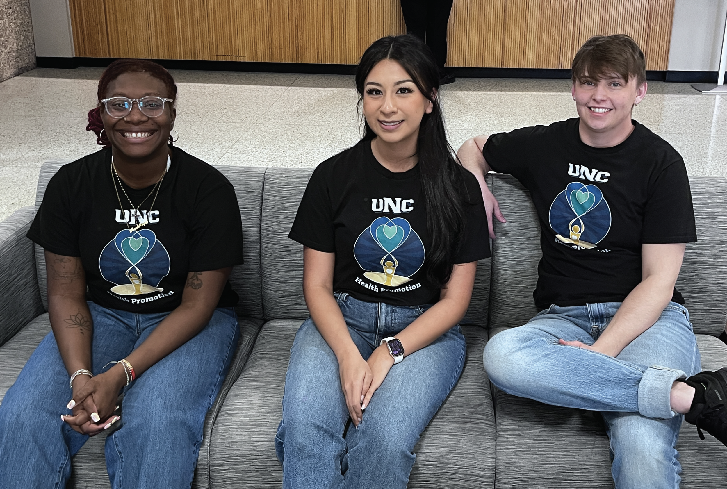
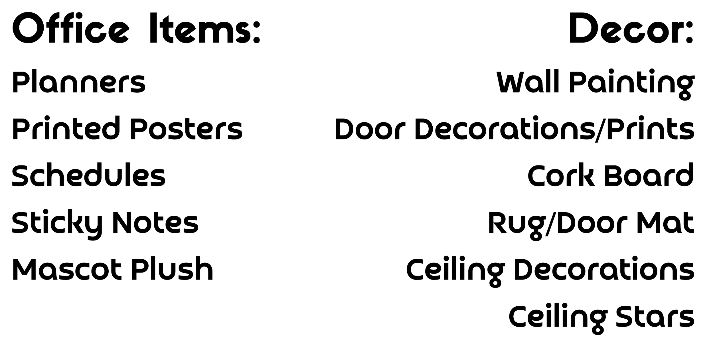
Although the project was unfortunately cut short due to scheduling and budgeting, we were tasked to rebrand our Creative Design Hub at the University of Northern Colorado.
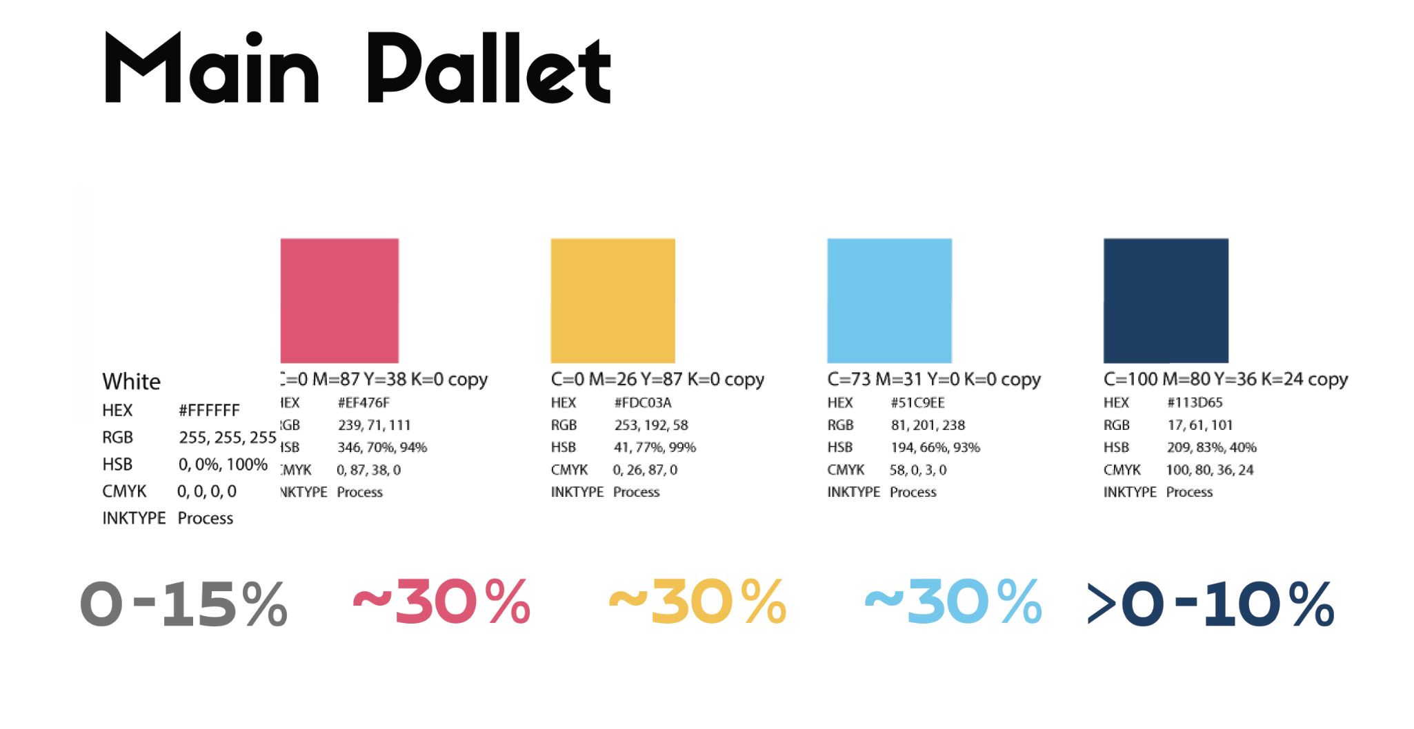
We began by distilling down our values. Most of all, we wanted to capture the environment to creating a welcoming feel for the future students that would eventually fill our place, since the brand would only apply to things within our own office.
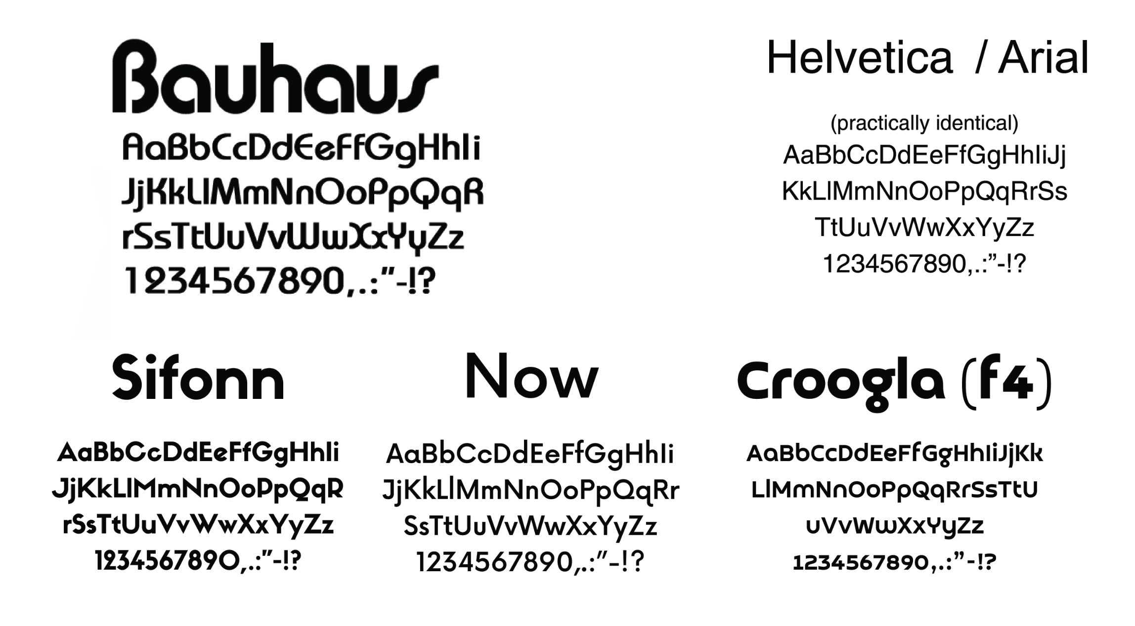
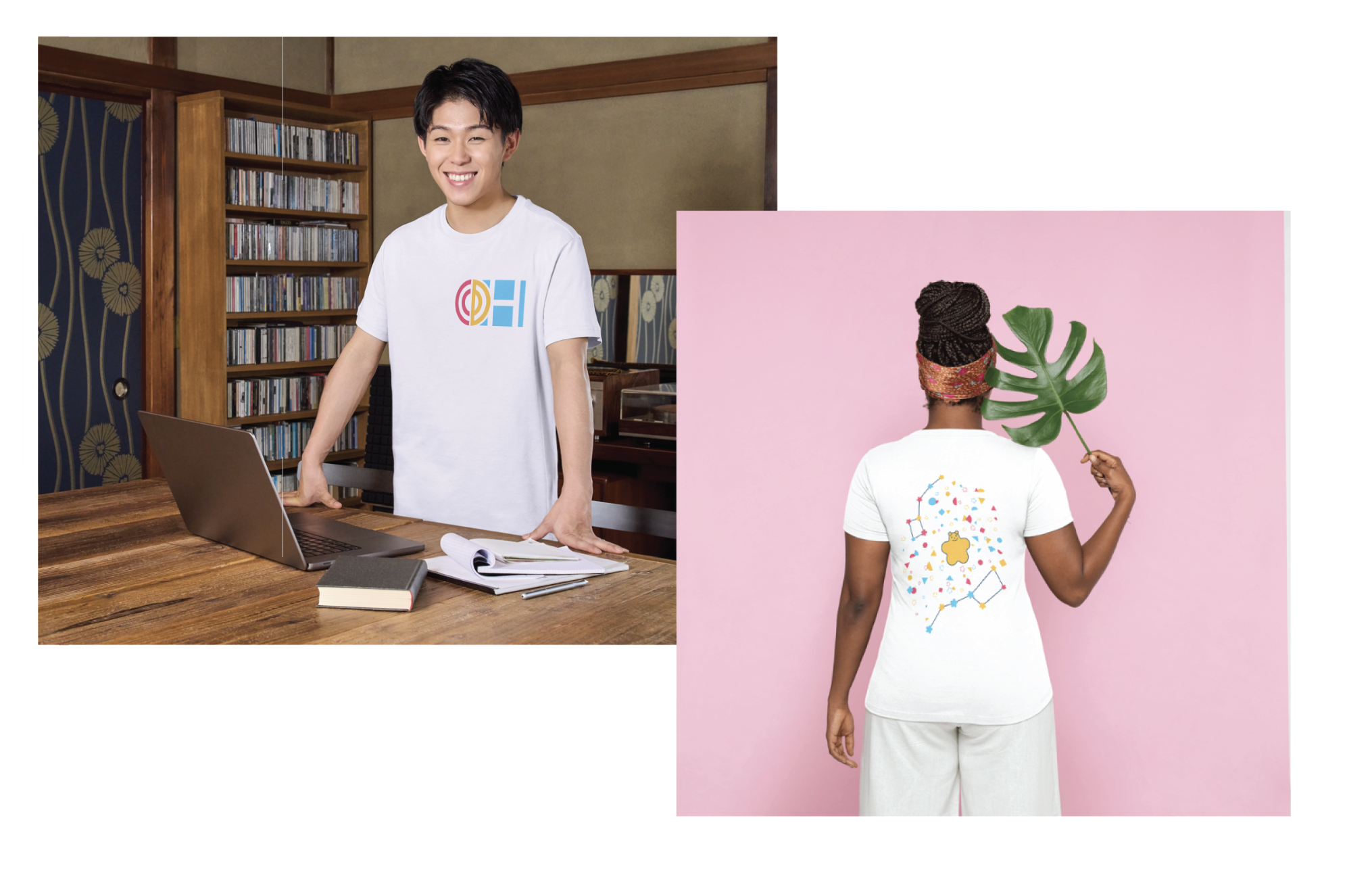
The Bauhaus style reflects the diversity of expertise our team had, since not everyone was an art student. It was welcoming, sophisticated, and accessible.
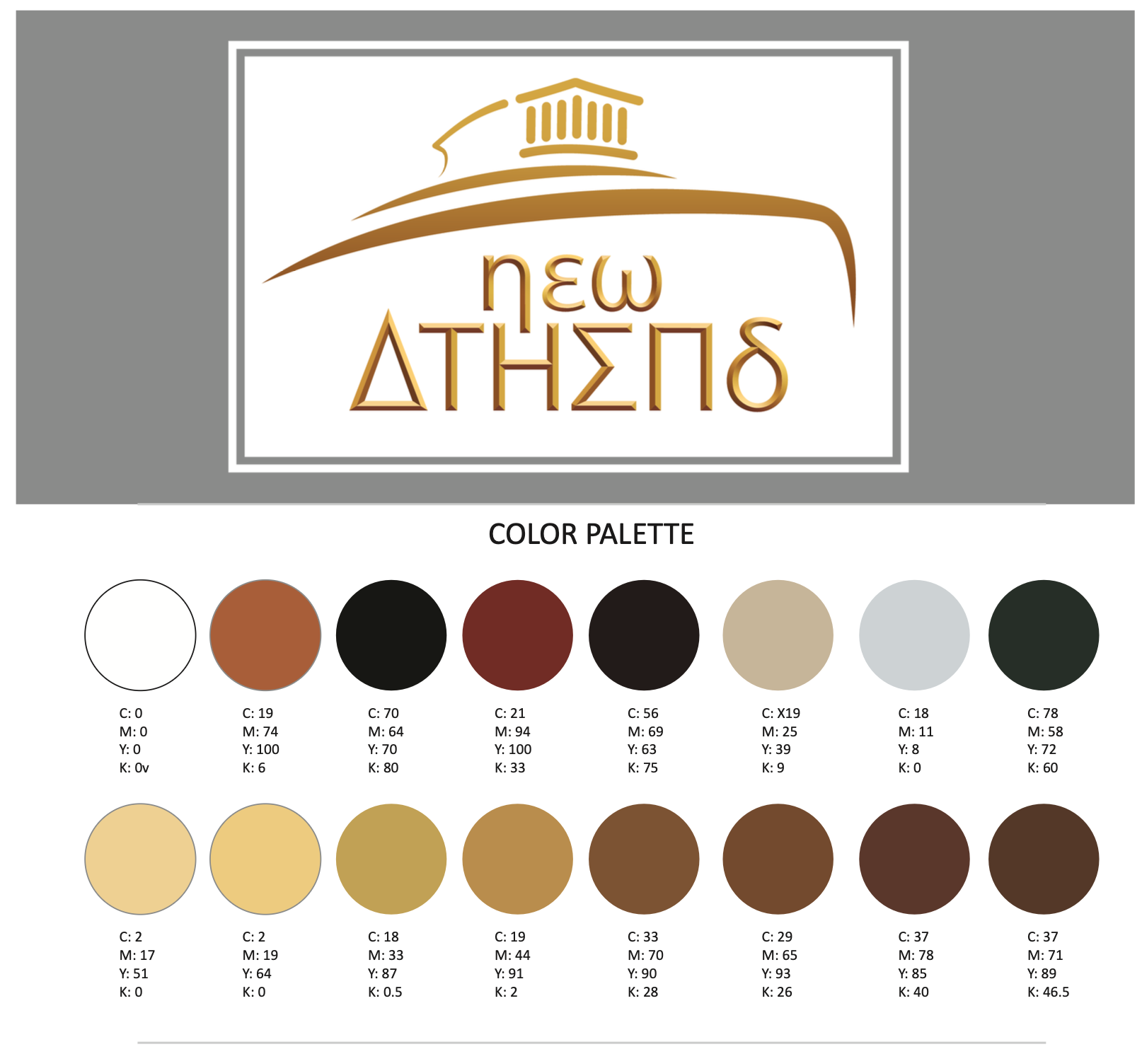
We also took this opportunity to apply ideas we had be juggling for completely rebranding UNC. Instead of “North of the Norm”, we wanted to center our brand on the North Star, which in fact is Ursa Minor. That opened the door to a much more consistent theme, and we disappointed that it never saw the light of day.


My time at the Creative Design Hub taught me the importance of adhering to clearly defined brand guidelines. We had the fortune to see UNC actually shift its brand as well. Additionally, the Division of Student affairs had their own “brands”, even if they weren’t written down, and it all helped open my eyes to branding everywhere around us, even in nature.